Give us a ring
The simple life is for me out here in Brunswick, Maryland. Give me a shout sometime and let's talk shop.
Reach out
phone:
email:
tomfoolery


-
Client:
IAEE is the global association for the exhibitions and events industry, including more than 1300 show organizers, exhibitors and exhibition supplier companies.
-
User Personas:
Ryan: (35) is a tech savy gen X that attends Expo! Expo! annually to learn the latest offerings.
Samantha: (55) is works as a product lead and attends Expo! Expo! to gather competitive intell, but wants to feel more connected to other attendees this year.
-
Tools:
Mac OS X, Sketch, inVision, Zeplin
Problem Statement:
Attendees find it difficult to network and stay engaged throughout the 3-day event. The amount of exhibitors and content to consume is a bit daunting. The time they spend on the show floor should be strategic in nature. They need to gather targeted information on exhibitors to share with stakeholders for consideration.
Mobile App (Before):
Accessibility Research:
High-fidelity Wireframes

My Responsibilities:
Competitive Benchmarking | Wireframe + Prototype
Researching how others were doing mobile app gamification didn't really yield a ton of insights, as our target audience and ultimate goal was very unique to the Expo! Expo! experience. With this being said, we determined that under the extremely tight deadline we really only had time to focus on increasing engagement for attendees. So we moved quickly into rapid wireframe and prototyping based off a very simplified customer journey map.
Users and Key Players:
Personify A2Z Events cloud-based software is purchased by a trade show manager. It is then deployed by a TSA (Technical Solution Architect). A dedicated (PM) Project Manager will deliver all Global Admin and public site url's for show managers and teams to login and begin their training in the system. See a few of the other stakeholders involved below:
- Client - (IAEE) had some say in what the experience would be.
- Product Management - The team responsible for organizing, managing and deploying the final product.
- Leadership - Our previous CEO was heavily involved with the solution as he was the original architect of the system.
- Design Team - The solution needed to be engaging, easy to find and fun!
- Sales Team - Sales needed to be able to speak on how robust, effective and simple it was to configure in Global Admin.
Research and Inspiration
This one was challenging as we didn't want to mirror or be influenced by any other systems in the industry. We did some competitive analysis to see what others were doing, but it did not factor into our decision-making process.
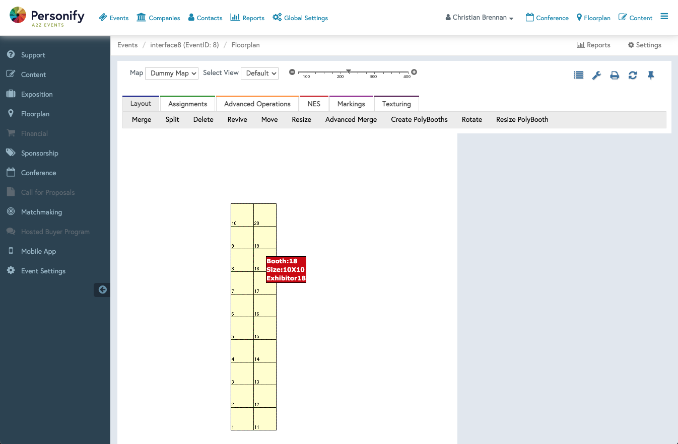
Figuring out the usability and heirarchy of the floorplan navigation was tricky. We didn't want it to compete with the global admin far-left or top navs, but we also wanted it to be very recognizable and approachable for users.
Ultimately, after various rounds of sketching, adjustments and internal A/B testing with the product team and leadership, we decided that a minified, far-right navigation would be the best fit for the re-design.
Rapid Wireframe + Prototyping
1 day exercise yielded 2 strong options.
Together with another very talented product designer, we began designing in Sketch and prototyping some initial low-fi and eventual high-fi options for consideration.
The 2 options for consideration were:
- A custom UI that put a lot of emphasis on the user and their game status.
- Winner A native iOS and Android UI that focused more on the over-all experience of moving the user on to the next task.
Additional Highlights
Overview:
Everything from how the H1 query title, the larger landing page search input, the results queries, filter pills and content hierarchy was condidered. See below some of the thoughts that went into all of it.
One of the biggest hurdles we faced was letting users know how to access the game once they've launched the app. The challenge was to make it obvious enough to see, but not for it to overshadow the more important tasks.

For this one we simply decided to let iOS to do the work. Users would choose from a directory of participating exhibitor booths they'd like to visit by simply clciking on the sponsor's icon that would trigger iOS's camera to use for scanning an exhibitor's QR at their repsective booth.

Not only did the color scheme have to fit with our internal, established brand and design system, but it had to be universal enough to plug in to our base or highly-customized client event sites.
Shipped to Production
